
The Alignment Design Principle
In the past couple of weeks, I’ve covered the proximity design principle, the continuation design principle and the closure design principle. These principles are part of the fundamental design principles that you need to understand when learning graphic design. The alignment design principle determines how things are placed on the page. Alignment is usually established by using a grid structure. Whether you are designing for print or the web, the alignment design principle plays an important role in the placement of every item in your design. Alignment is something that you have to consider, no matter what you’re designing. Without alignment, you would arbitrarily place images and text on the page, which would result in mass chaos. Your design would have no structure, which means no one would know where to start, or where to stop looking at your design.
The Alignment Design Principle Is Everywhere
Let’s use this blog as an example. Believe it or not, there is an underlying structure that determines the alignment of elements. Notice that the title of this article aligns with the text underneath on the left-hand side. This means that no matter how long the line of text is it will always line up on the left-hand side. You’ll also notice that the social media icons, and the photo that goes along with this article aligns with the left edge of the text. This is because in our culture we read from left to right and top to bottom. Most content in our culture aligns on the left-hand side.
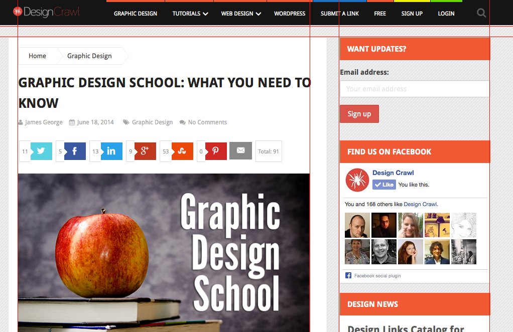
If you look at the content area of this blog, and the sidebar where it says “want updates?” the top edges align perfectly. This is no accident. This is due to the underlying grid structure that makes up the layout of this website. The grid structure allows us to divide our content into manageable chunks of information. Even though different sections have different information, you know that because it is aligned, it is associated as a great. In this site, notice how the logo is aligned with the navigation bar. It is all one straight line, so it is processed as one chunk of information. The different widgets in the sidebar contains different information, but the size relationship, combined with its alignment, helps you associate these items together.
Even though items are aligned via an underlying grid, you’ll notice there is space in between each sections. This space, combined with the alignment of the items on the grid help you to differentiate different sections of the website. All of these properties work together to help you organize and process this information in a way that makes sense. The main purpose of using alignment in a design, is to associate elements with one another.

