Proximity Design Principle
Last week, I discussed the closure design principle, which talks about how your eye automatically closes shapes with no edges. This week, I’m covering the proximity design principle. The proximity design principle means that when we see objects or elements that are close in proximity to each other, we automatically group them together. This is important in design, because if we can group items together, it helps to organize information and make it easier to understand and digest. This is essential for us, because it is part of our job. Learn more about the proximity design principle below. We’ll start off simple and then I’ll show you some real world examples.
The example shows a bunch of random circles that really have no proximity to one another. You see each one of these as a separate entity, which means that you have to process each one separately, because you don’t see how they relate to each other.

Now here are the same circles, some with more proximity to each other. You can see that even though they contain no information, your eye automatically processes three groups. These 3 groups are easier to process, so you can find the information you’re looking for.
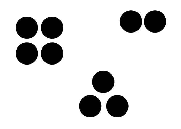
This is essential in the world of design. Viewers scan everything. They rarely read or take the time to look over the entire design. If you group things together well, scanners can find the area of focus that pertains to the info that they need personally, and process it and move on.
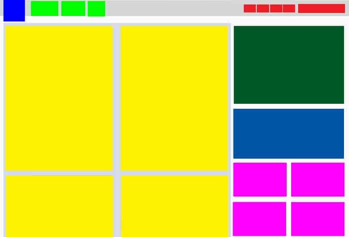
Proximity Design Principle: Real World Application
Lets look at my favorite web design website, Web Designer Depot. First, I’ll show you the site, and then I’ll show you how the proximity design principle applies to the site. Here is the live site.

Here’s the same site with the content set as blocks. I color coded the groups, so it would make it easier to understand.

You can see at the top that the logo is near the navigation elements. The nav elements in the top left are in close proximity, so they are grouped together. The social buttons on the right side are grouped together, too. The lavender box surrounding the yellow boxes represents the overall content area, which is represented by the posts, which are in yellow. The secondary content is in the sidebar, on the right side. Even this part of the design is broken down into groups. The large ad is by itself, as well as the subscribe box. The 4 pink boxes are a group of ads which are grouped together.
Conclusion
The proximity design principle is extremely important, because it makes us consider how we organize information within a design. Placing related information in close proximity only makes sense, because that is the simplest answer. Usually the simplest answer is the best one. Do you have any questions about the proximity design principle? I’ll be glad to help. Please leave your thoughts and questions in the comments section below.

