
Similarity Design Principle
The Closure Design Principle, The Proximity Design Principle, The Alignment Design Principle, and Continuation Design Principle have been covered in the past few weeks. What’s great about all of these principles is that they all work together to create a cohesive design. This week, we’ll cover the similarity design principle and how it works to build relationships and create associations within a design. The similarity design principle states that elements of a design that share common characteristics will have an appearance of belonging to each other. These characteristics can be size, shape, color, texture, or any other characteristics that can be carried across multiple elements.

The image above illustrates the similarity design principle. Most people will see the image above as a single line. Your brain will associate the circles as being one entity, even though it is made up of 33 smaller circles. When you look at a dashed border element in a design, you process the border as just that- a single border element, even though it is made up of many smaller dashes.
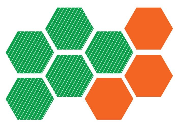
You can see from the example above, the objects above are all hexagons, created at the same size. However, some are green and striped, while the others are solid orange. When you look at these objects, you automatically group them together in 2 distinct groups. The first group is the 5 green striped hexagons. The other group is the set of solid orange ones.

The examples above show you how size and shape can determine how you associate different elements with each other. On the left, you have rounded purple squares in 2 sizes. Your eye and your mind process them as 2 separate groups. One group is the set of larger squares. The other group is the smaller set of squares. Even though they are the same shape and color, the size difference causes you to separate them.
The red circles are processed the same way. The larger circles form a left and bottom border, while the smaller circles are grouped together as a square of content in the top right.
Conclusion: The Similarity Design Principle
The Similarity design principle will help you create better associations between related areas of content. This is a great way to organize information. Understanding this principle will give you plenty of options for breaking down content into manageable, easy to digest sections. Do you have any questions about the similarity design principle? Leave your questions and thoughts in the comments section below.

