New Pizza Hut Logo Upgrade
I first learned of Pizza Hut’s upgrade to their logo a day or two ago from Creative Bloq’s article. While I’m not surprised, I wanted to take the time to evaluate their logo and go over why they may have upgraded. It was definitely necessary, and it’s an improvement. First, we’ll take a look at past versions of the Pizza Hut Logo, and its evolution over the years. Let’s take a look at the new Pizza Hut Logo an understand the purpose behind the new direction they are taking with their branding strategy.

The new Pizza Hut logo has an organic look that is more streamlined. It is simplified to 2 colors, with the still-recognizable logo we all know and love taking center stage. It’s easy to see that the logo represents a pizza crust. The imperfection of the logo looks like a realistic pizza in its simplified form. Way back in college, I used to deliver pizzas. I can tell you first hand that 98% of the pizzas that are made aren’t perfectly circular.
Evolution of the Pizza Hut Logo

The Pizza Hut logo has evolved at a steady pace over the years. The 2nd rendition of the logo is where they started using the literal hut image in their logo. They have evolved with the trends over the years, from the corporate look, to the glossy look of 5-7 years ago. More recent versions of the logo may have had too edgy of an appearance to be seen as family oriented. Organic, imperfect shapes, like the ones we see in the new logo, are more people-friendly.
The New Pizza Hut Logo is a Step in the Right Direction

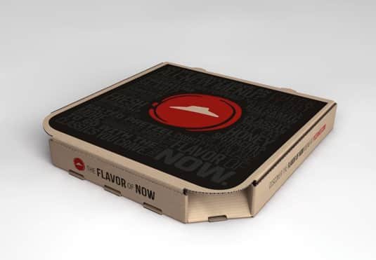
I am digging the typographic pizza box. Instead of going for the typical approach of showing all of the average ingredients that go into a pizza, they use visual hierarchy and type to get your attention. The new Pizza Hut logo takes center stage on the box, which helps to build recognition. The hut symbol is still present, and it’s an essential element for helping with the transition.
Conclusion
I don’t think the New Pizza Hut logo would have been successful if they hadn’t incorporated the recognizable hut shape. If they’d completely stripped that away, people would have trouble making the visual connection. What do you think of the new Pizza Hut logo? Do you like it, or do you think they are jumping on the bandwagon with other brands?


I quite like it, to be fair! (I’m a graphic/web designer too, been one for the past 14 years!)
I agree, it’s a well done rebranding effort by Pizza Hut. I like the organic touch of it and the reduction to one color. The boxes are outstanding. Now it looks more like a regular restaurant and less like fast food. Just my two cents worth.
I like the bullseye effect of the circular red dot. The “hat” is a nice carry over from earlier versions where it was distinctively the roofline of their proprietary buildings. Their unique roofline can’t be part of many sites where they aren’t a stand alone building. Good move. One color is smart from a production standpoint and implementation will be economical. The hand-drawn tomato paste has a lot of appetite appeal which is the number one requirement for food graphics. Keeping the handwritten type for recognition is good, but I hope in the next iteration they soften it a little. The pointed letterforms look aggressive and harsh. I’m not real big on the black secondary color (especially on the pizza box). It looks good in a design presentation, but in practice won’t signal fresh, hot or flavorful. It will smear, show greasy fingerprints and scuff. I suspect it will change in the next go-round, too. Pizza Hut has been a client in the past and despite the limitations from franchisees, they aren’t afraid to make changes and improvements quickly. Bravo.