Branching off from computer powerhouse, IBM, Lexmark has stood on its own as a maker of office printers for quite a while. Like most companies, when they want to reposition themselves or open their company up to new opportunities, they revamp their logo. Let’s take a look at the new Lexmark logo and its significance.

The Old Logo
Lexmark’s old logo wasn’t bad. It served them for years, and was a recognizable logo that wasn’t goofy or misshapen. It had a professional look for the business world, and represented quality, dependability, and durability. The red diamond made me think of a polygonal drop of ink, but maybe that was because a decade or so ago, I owned a Lexmark printer for my home office.

The New Lexmark Logo
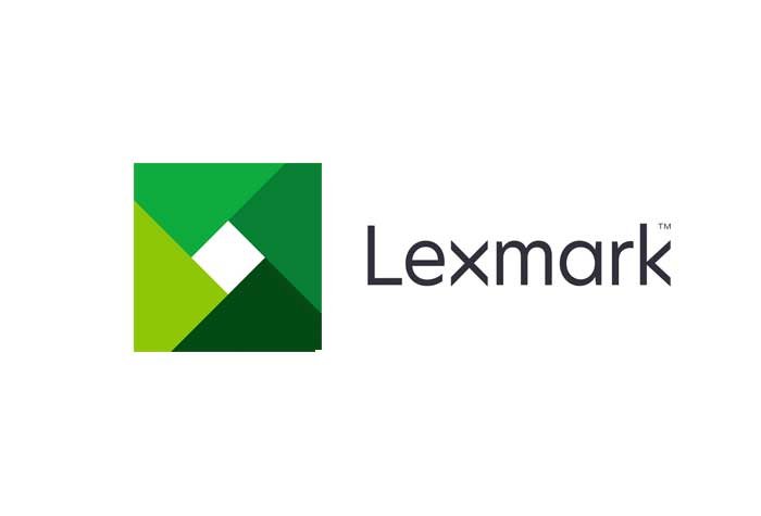
So now we get down to brass tax. Lexmark went in a completely different direction. They went from serif to sans serif for their typeface. There’s nothing special about the typeface they chose. However, what they did to make the logo stand out was. They turned the x on its side. The reason this still works without spacing issues is due to the fact that they chose a geometric font. This means that the letters like O’s and lowercase a’s are close to complete circles, instead of ovals.
![]()
The Logo Mark
If you notice, they dropped the diamond and went to a shutter. I am not sure if this means that they are going to branch into camera equipment, which isn’t likely, but the green is focused on sustainability. Many companies having to do with printing and paper try to leverage a small carbon footprint. They problem is, many companies did this years ago. Why are they doing this now? Most large companies don’t rebrand for no reason. This makes me extremely curious what they have planned for the future of Lexmark.
Conclusion
Overall, the new Lexmark logo is a success. I’ve seen worse rebrands, like JCPenny and Gap. Those redesigns were complete fiascos. Lexmark did a good job of rebranding without making too many waves. Most people are responding positively to the new Lexmark logo.
What do you think of the new Lexmark logo? Is it a step in the right direction? Do you think they could have done something better? I’d love to hear what you think. Leave your thoughts or comments below.

