
HootSuite has become one of the most popular tools for social media management. It seems like they haven’t been around that long, but they quickly take over the market for increasing productivity for performing social media tasks. In that short time HootSuite’s logo has become well-known and widespread across the entire Internet. Unexpectedly, HootSuite decided to change their logo. Despite the sudden change their logo was a complete success. We’ll take a look at HootSuite’s old logo and its new logo and why it was so successful.
The Old Logo Was Simple
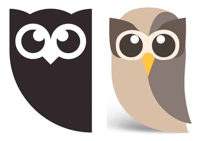
HootSuite’s old logo was fairly simple to begin with. It was made up of only a few shapes, which is easy to remember. Their logo had what is called staying power, which means that the owl symbol stayed with you easily. Due to HootSuite’s initial logo being so simple, it was easy to remember. This enabled brand recognition to be built quickly.
Hootsuite Is Used Daily
When you use something every single day, you get to know it quickly. Combine this with the simple logo approach that I mentioned above, makes it easy for people to recognize and remember your logo. If HootSuite wasn’t used as often as it is, I don’t think the new logo would have been as successful.
Their Branding Is Consistent
HootSuite did an excellent job of using their logo consistently across everything. Whether it was their Twitter account, Facebook, and even their mobile app icon, their logo is used consistently throughout. If there were any variations to their original logo throughout these platforms, it was miniscule and not noticeable.
Their New Logo Is A Simplified Form
The formation of HootSuite’s logo was unique. The overall shape of the original logo wasn’t a common shaped like a square or a circle. The left edge was curved and rounded over to the right bottom corner. This trait is unique and easily recognizable. In the new logo, they get rid of the individualized feathers and simplified the overall form with a solid shape.
The simplified version of the logo is done with the same style as the original. The cartoon eyes of the owl are consistent with the original. Combine that with the recognizable owl shape, and users could easily connect this with the old logo. The fact that HootSuite simplified their logo to be only one color is excellent.
They Rolled Out The Update Consistently
It seemed like one day they were using the old logo, and the next they were using the new. It was everywhere, and updated nearly all at once. By the time I noticed that they had changed the logo, it was president in all social media and app icons.
There Was No Hype
There was no talk about a new logo. HootSuite didn’t just update their logo in one area and test it out. Their update was instant, and they didn’t hold back. They updated their branding with confidence, knowing that they had made the right choice. Having confidence in your new logo and branding materials makes it easier for everyone else to accept it. The floor wasn’t open for feedback. That was their new logo, and that’s how it was going to be.
Conclusion
What do you think about HootSuite’s new logo? From a design and branding standpoint, it works, and it works well. The simplified form is easy to recognize and is consistent with its original logo. It is simply a more streamlined form, which only makes it easier to remember and recognize. I would love to hear your thoughts about HootSuite’s new logo. Feel free to leave your thoughts in the comments section below.

