Creating a Style Guide
What is a Style Guide?
A style guide is a manual, or a set of standards for the design of documents, either for general use or for a specific public use. These documents can be interoffice documents, documents used with client or customers, or documents provided publicly. It doesn’t matter whether a business is large or small, a style guide is an effective way to ensure consistent portrayal of all marketing materials. Many large, well-known business use style guides. If you want to see some style guide examples, there are many available online.
What is included in a style guide?
There are many things included in a quality style guide. Remember, a style guide is a set of guidelines to ensure your branding is represented properly. This includes proper use of the logo, the right typography, your brand’s colors, etc. Let’s take a closer look at the things that will be included in your style guide, plus some style guide tips.
Logo Usage
A logo should be displayed consistently on all marketing materials. If your company is wishy-washy on how it displays its logo, everyone else will be too. Part of building brand recognition is consistency.
Color Usage
You should specify the PMS, CMYK and RGB (for the web) values for your logo. This will ensure that your logo uses the same colors, whether they are on printed materials, or the web. Believe it or not, you should also specify the look of your logo in grayscale, too.
![]()
Space
There should be adequate space around the perimeter of your logo. Use measurements that make sense and that create proper proportions of space around your logo and any tagline that may be included. It’s a good idea to use letters within the logo as a reference.

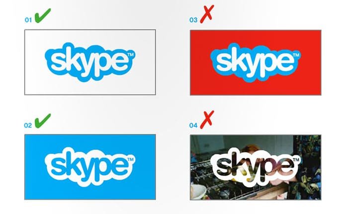
Show examples of how you should and shouldn’t display the logo
For example, you might specify that the logo shouldn’t have any strokes, shadows or glows applied to it. You can also specify colors that should be used with the logo, or whether to place a background color behind the logo over photos. The goal here is to make it very clear as to how the logo should and shouldn’t be displayed. This ensures that the logo isn’t used in a way that detracts from the business’s credibility.
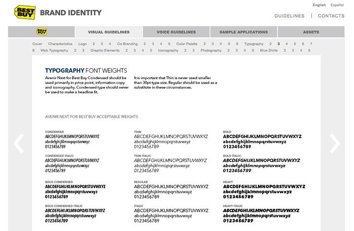
Typography
This is one of the most important areas of your style guide. You’ll specify instructions for every aspect of the typography being used. You should specify the names of the fonts and font families. You should also list the weights used, and whether they are Roman, condensed, bold, semi bold, demi, etc. You might also specify a required line-height or leading between each line of body text.
This guide isn’t just for the typography that accompanies your logo. It should specify the font used in the logo, too. You’ll want to mention the exact font-size, weight, family, and anything else, in order to ensure consistency.
Other Elements
Depending on the company, your style guide may include other usage guidelines. For example, you could include guidelines for signage, as well as uniforms and other aspects of the business. For example, I had a client that wanted dedicated icons to represent their bakery. Those icons were definitely included in the style guide. This was essential for proper usage of all elements in a consistent manner.

Conclusion
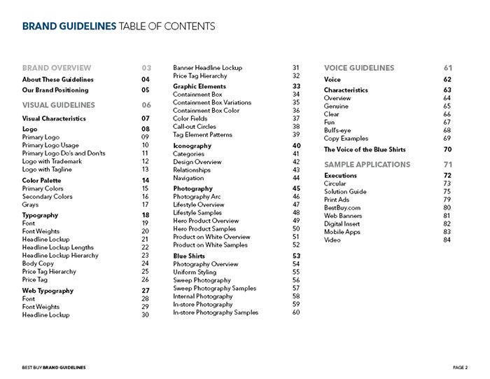
Your style guide is important for ensuring the consistent portrayal of your logo and brand on all marketing materials. Consistency and repetition is the quickest way to build brand recognition for your business. You can keep it as simple, or be as specific as you’d like with each style guide. Just take a look at how extensive the Best Buy style guide is. It has a table of contents!

