
Ayres Free Font
Every now and then you come across a free font that you immediately love. This week’s free font is just that kind of font. The Ayres free font by Mariel Gornati is the free font of the week. it is rounded, smooth, and has a whimsical appeal that you’ll love. Ayres includes ligatures and alternate glyphs, which is awesome. You know that Mariel took some time when crafting this typeface. Take a look at the Ayres free font below.
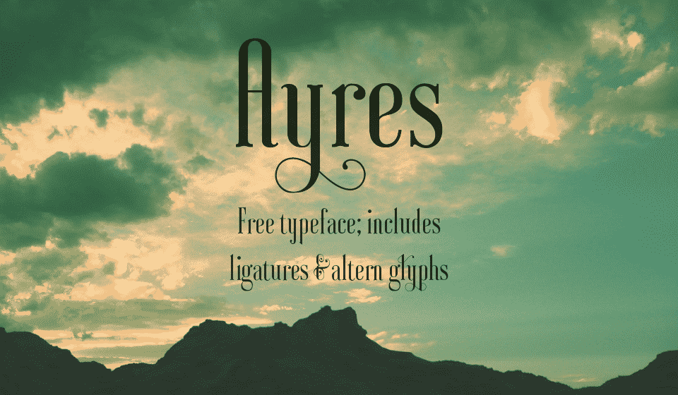
Ayres has a high-end, fancy look, with large loops. The best part of this is that the extra details doesn’t take away from its legibility. Every letter is easy to read, without any mistakes. The craftsmanship is impeccable.
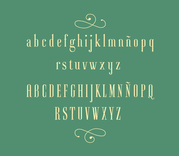
Ayres has a tall x-height, which adds to its elegance. Even the vertical serifs on the letter Z and E are tall. The details are great, too. Notice how the crossbar in the lowercase e is angled, not horizontal. The rounded edges and details like these help the typeface to have a smooth flow from one letter to the next.
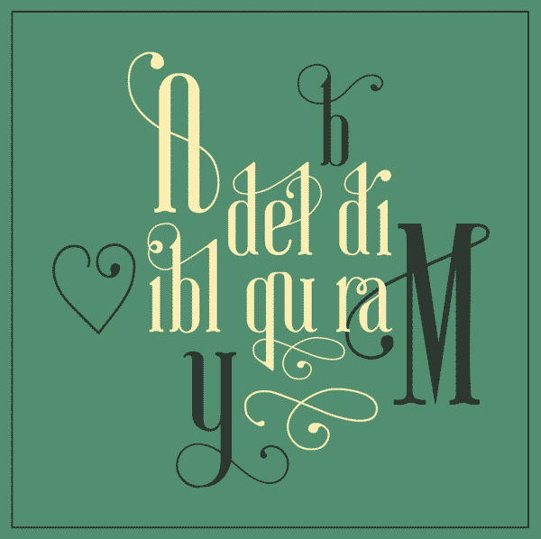
Ligatures and alternates are included. I love how the long swashes curl around without hindering the readability of each letter. For example, look at the uppercase A. It actually becomes part of the crossbar of the a, serves dual purposes of decoration and functionality. That’s why it works so well.
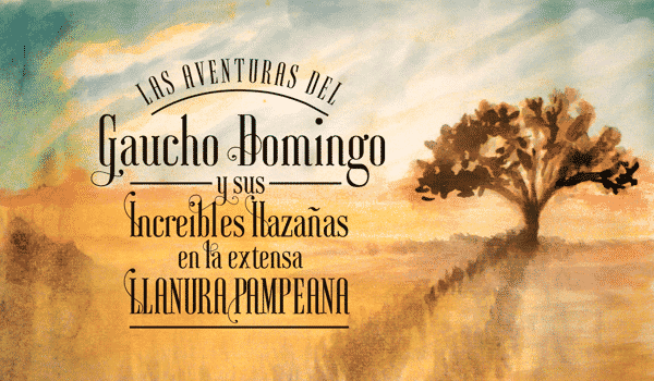
The Ayres free font looks great no matter where you put it. It adds a touch of class to everything, while being easy to read. What do you think about Ayres? I think it could easily be one of the best new free fonts I’ve seen lately. if you want to download the Ayres free font, click the link below to be taken to the download page. Also, be sure to check out Mariel’s Behance page and appreciate her project and all of the time and craftsmanship that went into the typeface.

