Letterhead Design Tips
One thing that’s not likely to change anytime soon is the need for business documents. One of the most important business documents is a company’s letterhead. A company letterhead features all of your contact information, your logo, and anything else that you may deem important. It’s important to understand you can’t just throw basic information on your page and call it a letterhead. Following simple tips will ensure you create a beautiful letterhead design. Let’s discuss the qualities that make up a professionally designed letterhead.

Color
The best letterhead designs give you a sense of the company that it’s from. For example, a letterhead from Sprint is likely to have the signature yellow and black colors that you would expect. These colors are great for the company letterhead, because they provide a lot of contrast. This simply stems from the basics of having a good color scheme for your brand to begin with.
It’s important to keep in mind though, that you shouldn’t overpower the letterhead with a lot of color. You need to leave enough room for a decent amount of text. If you use a lot of color, especially color that is dense or they can compete with text, you won’t get much use out of your letterhead. It’ll be difficult to read and recipients will just cast it aside.
Paper
Your letterhead design is only as good as the paper that it’s printed on. Don’t use cheap copy paper for your letterhead’s. It’s a good idea to use a quality linen paper or something of good quality. The paper that your letterhead is printed on speaks of the quality of your company’s products or services. Paying attention to these details will speak volumes about your business.
Hierarchy
Make it easy for people to find the most important information. Don’t just plaster a giant logo on some linen paper. Emphasize what’s important using size, font weight, color, and even italics. It’s the varying degrees of difference that enable your clients to separate chunks of information.
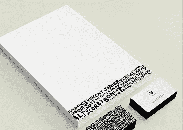
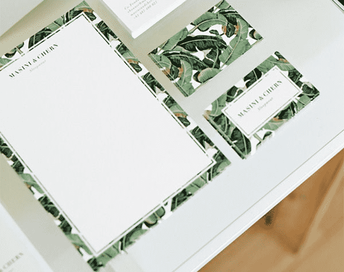
Use elements from other branding materials
This tip will help you to create a cohesive set of branding materials. If your direct mailers, business cards, and folders have certain design elements, carry them over into your letterhead. For example, if your brand uses circles dots or stripes, use those same elements somewhere in your letterhead.

Group Chunks of Information and Align Them Visually
It’s important to remember not to just scatter information across your letterhead. Remember your design principles and align elements so that they are connected in some way. You could have it so that the logo aligns with the left edge of your text. Another approach could be that all of the contact information is spaced out in a straight line that is aligned to the bottom of the letterhead.
Keep it simple
Don’t try to cram too much information on your letterhead. Stick to pertinent information such as telephone, email, physical mailing address and fax if needed. I wouldn’t include any text longer than a few words. This could be your company slogan. However, no other form of text is needed.
Conclusion
If you stick to these basic principles, your company’s letterhead should be elegant, but eye-catching. And it’ll look professional and sophisticated, and speak volumes for your brand. Remember the phrase of Milton Glaser, that “Just enough is more.” Adding elements just for decoration is unnecessary and only complicates a professional document that is meant to be simple.
Do you have any letterhead design tips to add? If you have any questions about the letterhead design tips from this post, feel free to leave them in the comments section below.

