About Saul Bass
Chances are that you’ve seen Saul Bass’s work, and not even realized it. Not only has he designed logos for some of the biggest and time-tested companies in the United States, but he has also created the opening credits for most films we’ve all seen. From the mid 50s to the mid 90s, Bass created movies posters, logos, and title sequences to movies we all know and love. It’s time we take a look at Saul Bass and his extraordinary work.
Saul Bass: The Beginning
Saul Bass Studied at the Art Students League and went to night classes and Brooklyn College. I find this interesting, because most other great and prolific graphic designers went to well-known, esteemed colleges, or studied at multiple art colleges. Bass seemed to go to school, just to get enough education to find a job. He ended up in Hollywood, doing print work for movie posters and ads.
Eventually, Saul Bass got his big break when he collaborated with Otto Preminger and created a poster for his move called “Carmen Jones”. Preminger loved his work, and asked him to create the opening title sequence. Bass seized the opportunity, and made a sequence that blew everyone away.
The Work of Saul Bass
Saul Bass was brilliantly creative. He worked with great film makers, such as Alfred Hitchcock and Martin Scorsese. He literally invented kinetic typography. You can see his work in title sequences for North by Northwest, Vertigo and Psycho. These were all movies done in the 1950s.
Newer movies that he worked on, are some that I personally grew up with. He created the opening title sequences for Goodfellas, Cape Fear, The Age of Innocence and Casino.
Logos


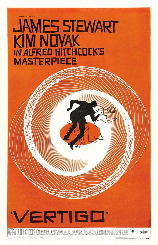
Posters

His poster for Vertigo captures the essence of being disoriented and out of balance. The spiral design really gives you a sense of dizzying motion. Notice the hand-lettered type for Vertigo. However, you can’t miss the spot on precision of the spiral, which would have been tough to pull off at that time.
Title Sequences (With links: Watch!)
Vertigo
Casino
Cape Fear
Goodfellas
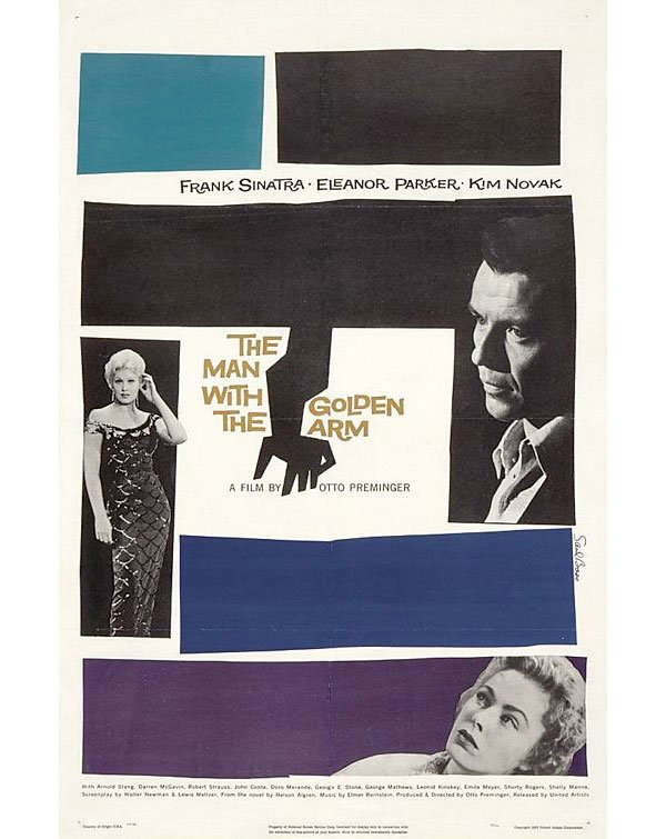
The Man With The Golden Arm
Psycho
Ocean’s Eleven
Grand Prix
Nine Hours to Rama
Spartacus
Carmen Jones
The War of the Roses
Exodus
West Side Story
North by Northwest
Accomplishments
Surprisingly, I couldn’t find a lot of awards or recognition for Saul Bass’s work. He received an AIGA Medal in 1981. He also won an Academy Award and an Oscar for his film Why Man Creates. Other than that, no one anywhere mentions any other awards for his amazing work. This brings me to the conclusion that he is one of the most unappreciated graphic designers in history. With his extensive work, he should have an awards and accomplishment list a mile long.
Conclusion
Which one of Saul Bass’ works is your favorite? I love his logos, but I also love the title sequences for North by Northwest and Cape Fear. It’s a tough decision! I’d love to hear what you think. Which one of his works jumps out at you? Leave your thoughts in the comments section below.

