Typography Collection
It’s time for another collection of typography inspiration. You won’t be disappointed this week. I have put together a stellar collection of awesome hand type. You’ll see great examples of craftsmanship. You’ll be amazed at the detail of these typographic works. Let’s take a look at this week’s typography inspiration.
Chalk Alphabet
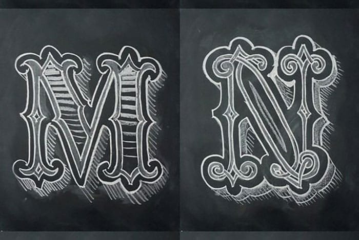
I have never in my life drawn anything that even looks good in chalk. I couldn’t imagine drawing a detailed alphabet with it. Each letter is consistent and well crafted, which you can see in the image above. I love the vintage style. I also like how each one has a defined outline.
Typography Sketchbook
Want to see the lettering of a lot of designers’ sketchbooks all at once? This book would be a great choice of inspiration to anyone who needs some inspiration.
Vintage Denim Company
I’m a sucker for vintage style type. Every good typeface takes patience and craftsmanship. A vintage typeface takes even more, because it is usually more decorative. I like the mix of regular type and type with linear shadows.
Flourish Hand Lettering
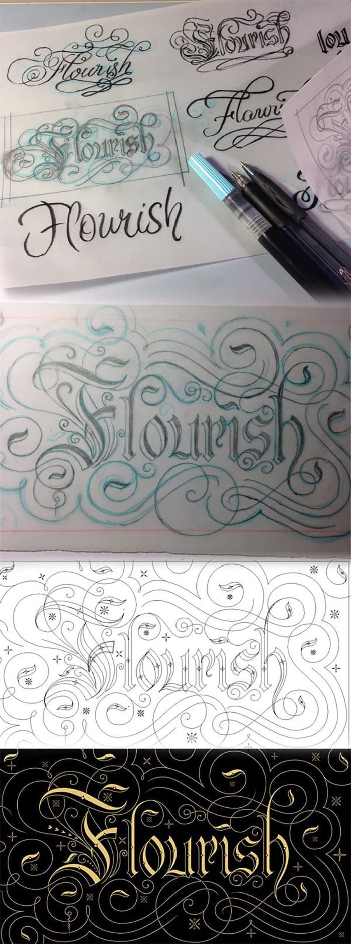
The example above shows you the stages of a hand lettering project from sketch to completion. Not only is each letter beautiful, it is embellished with ornamentation, too.
Brilant Typeface
Brilant has an immediate hand crafted look that just screams vintage. Each letter’s imperfections add to the overall vintage effect.
3D Ghost Type
This is a cool concept, where the letters are 3 dimensional. Combine that with clipping and overlay effects, and you have a strong visual typographic piece.
Skillshare Hand Lettering Examples
Skillshare has ton of hand lettering courses. They are all useful for teaching you how to create beautiful hand lettering, just like the examples above. My favorite is the craft beers one.
Typographic Einstein
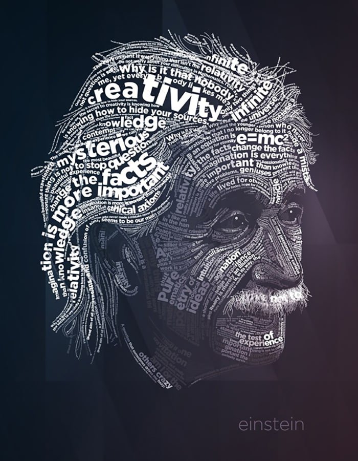
This style has always been popular, especially for portraits. Using quotes and information about that person is a great way to give a design visual staying power.
Coco Identity
I love this identity concept. The idea that the actual object becomes the lettering is clever. Using the shapes of the logo as a pattern is even better.
Stippled Typography (Wow!)
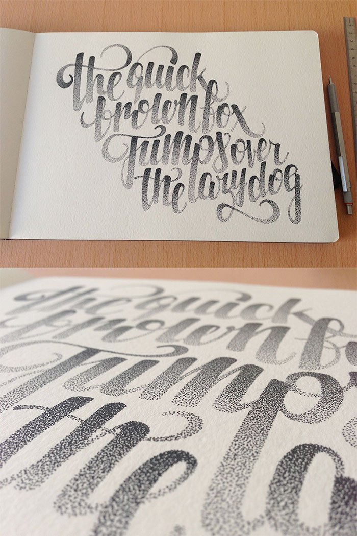
Believe it or not, this text is made with dots. This is called stippling, and it required a lot of patience. It also requires a good eye, especially for creating text with this level of consistency.
Conclusion
Which one of these typography examples are your favorite? A lot of work went into all of these. If you take anything away from this, it should be that great typography takes time, patience, and skill.


