Type Inspiration 2016
It’s been a while since I’ve shared some killer type inspiration, but I am back with a vengeance this week with some killer examples from around the web. Whether you like 3D type, type illustrations, hand lettering, pen and ink, painted type or anything else, you’ll love the collection I’ve put together. You can never have too much type inspiration to get the juices flowing. Let’s take a look at some great examples of creativity with type.
It’s hard enough to get type to look good in two dimensional form, but making it convincingly look good in 3D form adds an extra layer of challenges to the mix. The scale of this type overpowers the entire design, giving it a dominant and ominous appeal.
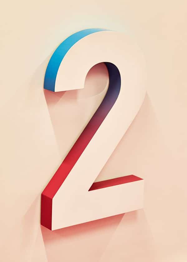
I’m a sucker for 3D type, and when you add color contrast to the mix, you get something that really gets your attention. Most people would expect the color to be on the actual flat surface of the 2, not the raised portion. it makes it looks as if it was carved from one material.
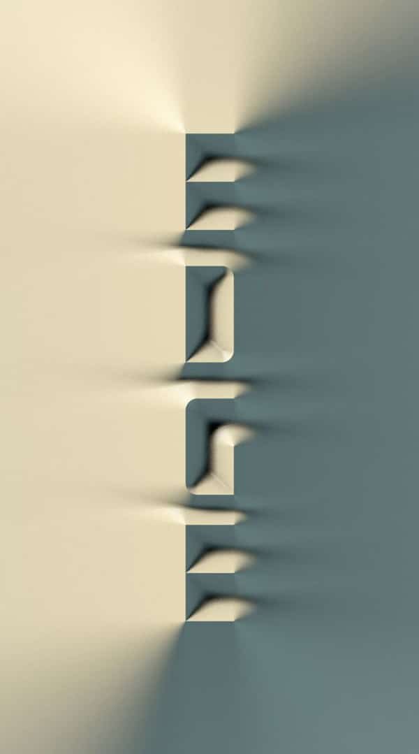
We all know the bevel effect you can get with Photoshop, but I’ve never actually seen anyone use it to make something. This is successful, simply because of how the light and shadow areas interact with each other to make the edges still legible.

I don’t know what’s sexier than 30 ampersands in different typefaces. Just looking at this one letterform tells you how much a subtle variation in the form can have a drastic affect on the look.
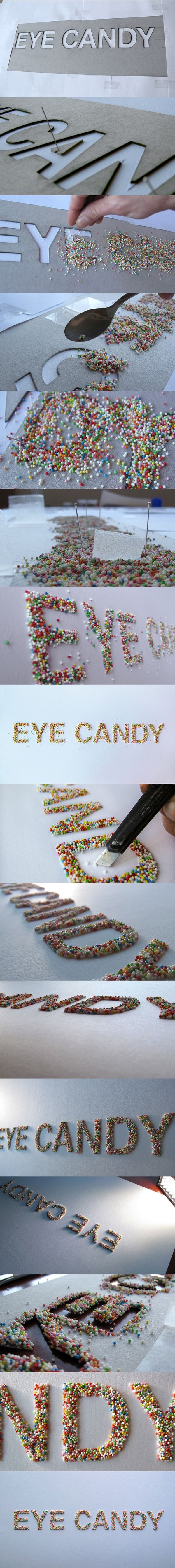
I love when someone takes something unexpected and turns it into typography. This artist took real candy and made consistent type with it. What a powerful visual representation!
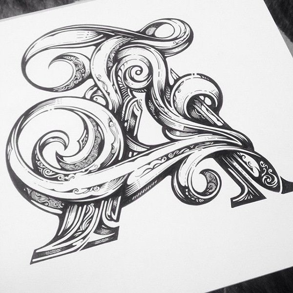
I love when an artist takes craftsmanship to the next level. Imagine the amount of work that went into this single letter! I have an appreciation for this level of patience and execution.

Not only is the type easy to read, but you know exactly what it’s supposed to be. This is quality design and execution!
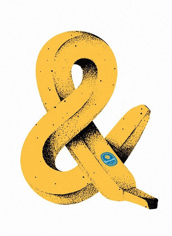
I love the vintage look, ad to create the ampersand from a banana is brilliant. The shadows are well done, and the sense of style keeps the letter form consistent.

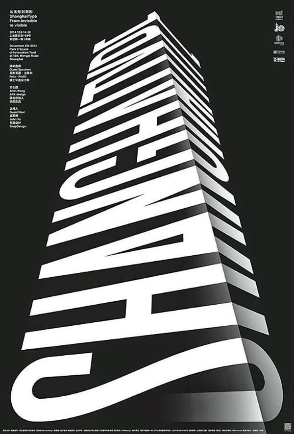
3D type inspiration is some of my favorite work. it’s one thing to create type on paper, to to arrange and compose it in 3 dimensional space is a completely different ballpark. Imagine the thought that goes into light, shadows, and reflections.

Not only do I love the colors of the work above, but the detail and fluidity of each piece of it makes this a show piece. Keeping with the organic style, while keeping the letters looking consistent was a hge undertaking.
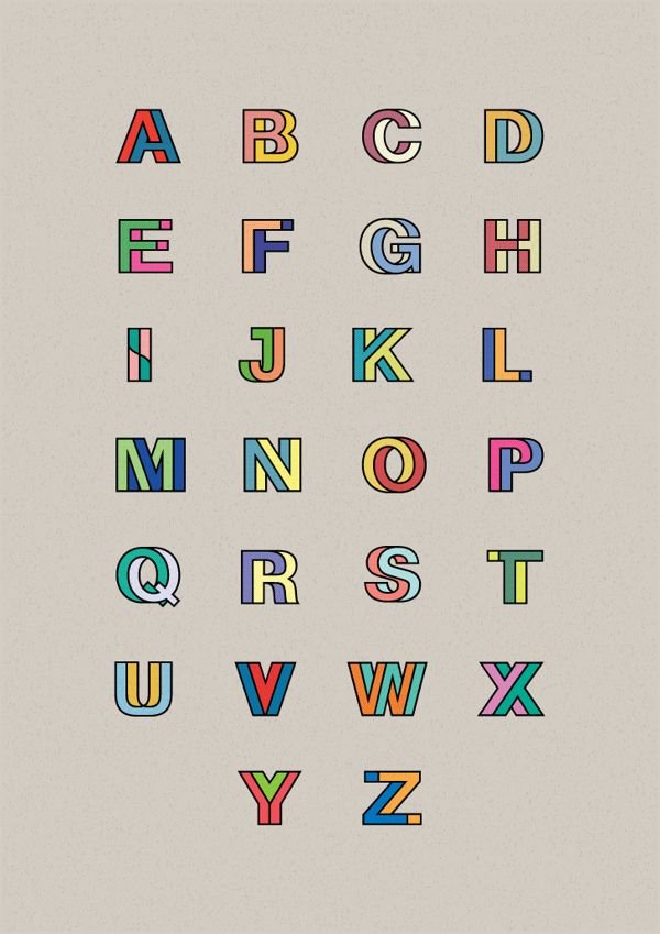
I love the design above for it’s simplicity and its pure genius. The 2 tone color scheme enables you to get a figure-ground effect, while adding a sense of dimension to it at the same time. It messes with your vision a bit, but it’s definitely cool to look at.

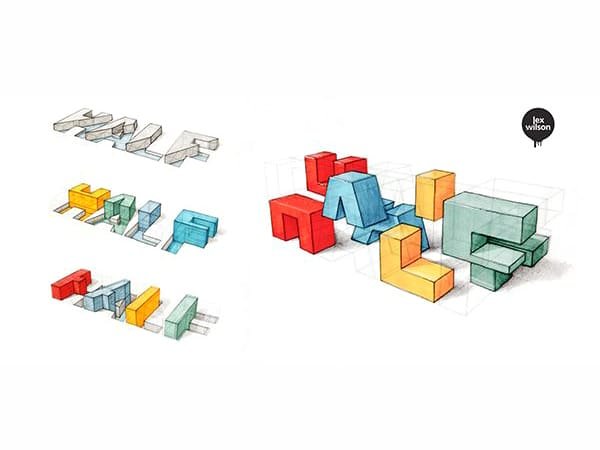
The examples above are hand drawn, which makes them even more killer in my book. Not only are the 3 dimensional, but they use raised and carved surfaces, too.
Conclusion
You’ve gotten to see some great examples of type inspiration from some great artists. From 3D to hand drawn, each of these designs stretch the boundaries of typographic thinking. Which one is your favorite from the collection? It’s a tough choice for me, because I love them all, but I would have to say the last one, with the hand-drawn 3D stands out in terms of thought and execution.


My socks are still on, but these are indeed some wonderful examples of typography 🙂 I especially like the first 3D one.