Hierarchy Is Control
When you look at any form of art, whether it is a traditional artist’s work, or it’s a professional design, it has a path that you naturally follow as you look over it. How does your eye know where to go next? It really doesn’t. It’s manipulated into looking at certain elements in a certain order, due to it’s appearance. This whole process is called visual hierarchy.
There are several factors that go into hierarchy. These factors can be combined with one another to add a lot of variety to your visual hierarchy. Lets take a look at ways to break things down visually in your designs.
Bold Text
Headings are a great way to break down text. If your design is text heavy, break it into sections and add headings and sub headings. These headings give readers an idea of what each paragraph is about. This is important because most people scan text. They don’t read every word.

Size
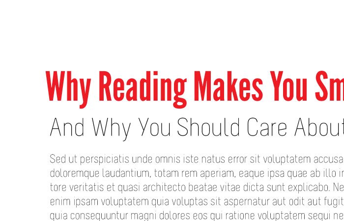
Want to make sure something gets seen first? Make it big. The bigger it is, the harder it is to miss. Big text, a large bold object, or a huge image of a person will get people’s attention before anything else. This is especially true for type. I mentioned headlines and sub headlines earlier. You can also combine those with color to separate elements. Think of a bold, red headline with a thin grey sub headline and much smaller black text.

Color
Red is the color that is seen first, before anything else. Combine that with size or making it bold if it’s text, and your viewers will notice that element first. If something is red, but isn’t the biggest element, it can still be seen before anything else. Usually bright colors get the most initial attention.
Weight
In terms of text, you’ll notice a bold font before you’ll notice a thin one. This is commonly used with headlines and sub headlines. You’ll see a dark, bold headline, and then a lot of designers will use a lighter colored (grey, slate blue, charcoal) sub headline.
Space
Want to call extra attention to something? Put a lot of space around it. Even if it is small, if it is surrounded by a lot of space it will get noticed. Space between lines of text in a paragraph help, too. If lines of text don’t have enough leading, it can make the paragraph appear to be too dense, not to mention hard to read, causing the paragraph to get more attention than it should.
Composition
Most readable documents her in the U.S. or the U.K. are read in a Z pattern. This means that viewers will start in the top left and move to the right, then shift to the bottom left and then the bottom right. Knowing this, you can use this to your advantage and place the most important element in the top right corner, where most of your viewers will be looking first.
Conclusion
One of the keys to mastering design is to understand how to control the way peoples’ eyes move around a design. When you learn to apply this in creative ways, you can create designs that have elements of the unexpected, and you’ll learn how to control your viewers and how they receive information. Can you think of any other elements that determine visual hierarchy? I’d love to hear your thoughts. Leave your answers in the comments section below.

