About Paul Rand
Paul Rand is one of the most influential graphic designers of our time. His work is the epitome of what real graphic design is all about. When you look at his work, it’s usually simple and elegant. You won’t find a lot of extra ornamentation in his design work. That’s typically why it worked so well. He is most famous for his logo design work. He worked for powerhouse companies, such as IBM, UPS, Enron, and ABC. His simple Swiss design style is what made his works are popular. His approach to design was masterful, and the longevity of his work surpassed the normal lifespan for a corporate logo.
![]()
Paul Rand’s Background
Rand went to school at the Pratt Institute (1929–1932). Then, he went to Parsons The New School for Design (1932–33). Then, he finished up at the Art Students League (1933–?1) at Yale University in New Haven, Connecticut. Going to such great schools laid a great foundation for who would become one of the best graphic designers in modern history.
Paul Rand worked with other geniuses of our time, including Steve Jobs. You can find interviews of Paul Rand online. Paul Rand embraced Modernism. You can see that reflected in almost all of his work. Everything he designed had a modern, simple, and streamlined approach. He had this to say about modernism:
“I haven’t changed my mind about modernism from the first day I ever did it…. It means integrity; it means honesty; it means the absence of sentimentality and the absence of nostalgia; it means simplicity; it means clarity. That’s what modernism means to me”
For example, his IBM logo is derived from the scan lines that you would see from computers and printers of that time. Using the simple design principle of closure, your eye still sees the letters I, B, and M.
![]()
Another example of Swiss and modern design is the ABC logo. This is a logo that he is most famous for. The letters are lowercase and placed within a circle. You can’t get much simpler than that. However, that logo remained unchanged for three decades.
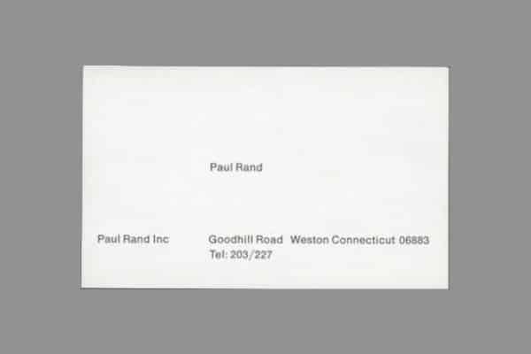
Even his business card was extremely simplistic. I was able to find this example online, and was blown away at how simple it was. There was no logo, and no frills or ornamentation. You only see his business name, his name, and his contact information. One thing I did find interesting was that when you overlay an example of the Golden grid over his business card, the elements are very close.
Interesting Facts About Paul Rand
Paul Rand wasn’t his real name. He was actually Jewish, and his real name was Peretz Rosenbaum. Paul was short for Peretz, and Rand from his uncle to form his business name.
Paul Rand was a go-getter. He was designing page layouts for Esquire Magazine at 23. People dream of doing that in their 40s and 50s.
Two variations of the striped IBM logo were designed. One had eight stripes, and the other one had thirteen stripes.
Paul Rand: Conclusion
If you love design as much as I do, then you owe it to yourself to look into Paul Rand. Watch his interviews, study his work, and think about how he always approached design. You will only make your work better if you understand the design and thought process of a true master. Which of Paul Rand’s designs are your favorite? Personally, I have always been a fan of the ABC logo. I would love to have been in the board room when he unveiled it. If you would like to know more about Paul Rand, you can see much more here.


I love this blog and I find what you post to be informative and inspiring.
Thank you so much Andrea! I’ll do my best to continue posting good stuff.
Good stuff James, I had no idea about Mr. Rand, thanks for the to-the-point bio.