
Typography Inspiration
You can never seem to get enough typography inspiration. It’s not just the message, but the letter forms themselves that seem to tell a story. You’d be amazed at how many ways you can display type in a creative way. Type itself can be considered a design element. How you arrange your type, along with your color choices and design structure can reinforce the message that you’re trying to send. For the past couple of weeks I’ve been sharing some of the best examples of typography inspiration I can find on the web. This week, I put together a collection of typography inspiration that pushes the boundaries of what you can do with type.
Optical Type Illusion
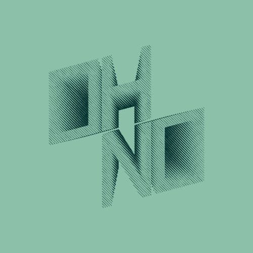
This design must of taking a long time to pull off. The thickness of the lines had to be perfect in order to pull off this optical illusion. This effect is created positive and negative space, combined with visual density.
Rotated 3D Type

This example blew my mind when I first saw it. It’s one thing to play with positive and negative space, but it’s another to play with positioning in the third dimension. The whole point of design is to make someone stop and look. If this doesn’t make you stop, look, and explore the design as a whole, I don’t know what will.
Clever Paper Cut Type

This example of typography inspiration took a lot of forethought. The designer had to think about each letter. They had to divide it so that once you folded the paper each letter was properly represented. I can easily make out each letter, despite the fact that they are completely simplified forms.
Clever Shadow Typography
I chose this example because of its corporate use of shadows. If you look closely, there is no gradation with the shadow itself. In places where the shadow overlaps, it is no darker than any place else. Usually where shadows overlap, they are darker. This produces an expected result. I would’ve never thought streamlining the shadows in this typography example.
Hand Drawn Skulls
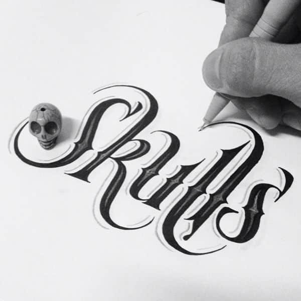
I love stunning examples of typographic craftsmanship. This is certainly one of those examples. The ascenders and the tails some of the letters are perfectly elongated. I really like the thin outline, which gives the look of a shy on the left edge of each letter. The highlighted portions within each letter, creates a sort of beveled effect.
Intricately Drawn Type
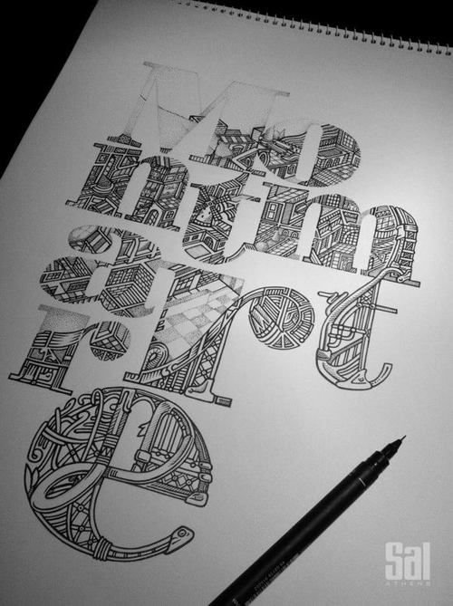
Speaking of craftsmanship, the hand lettering in this illustrative type example is extremely detailed. I was blown away at how intricately each letter is illustrated.
Peeling Type Illusion
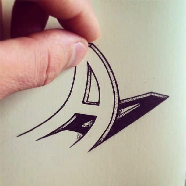
I am a sucker for optical illusions. It’s one thing to create beautiful type, but it’s another to fool someone visually. The shadows in this example are very well done for being drawn in ink. Whenever you create something clever, no mater how simple it is, you have my attention.
Pressed Type Experiment

I’m a big fan of letterpress design. This example takes it a step further with its deep impressions on specific letters. The Os, Ms and Ws are pressed to perfection.
4D Typography
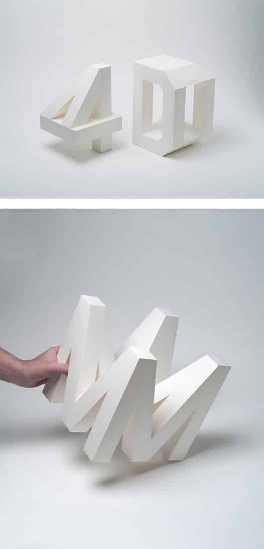
This example of typography inspiration blew me away. It’s hard enough to create a typeface in two dimensions. To render it in three dimensions is considered a challenge. To create a typeface in four dimensions is astonishing. Imagine the level of thought and planning that went into this example.
Illustrated 25
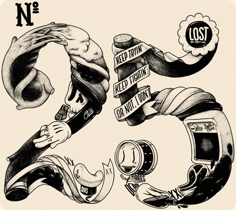
Illustrated type is not effective way to get attention. This example has many images built into both numbers. You will find all sorts of hidden images that come together to form these two numbers. Our eyes first see the numbers as a whole, because of the wall of continuation. Our eyes will complete the simplest shapes first. Then, as we spend more time looking at the composition, we notice each individual piece. This is an incredible and effective way to tell a story with type.
Conclusion
I hope you enjoyed these excellent examples of typography inspiration for the week. I was blown away by some of these, just because I know of the level of craftsmanship, planning, and imagination that went into each project. Hopefully, this will inspire you to create your own amazing typographic work. Which one of these examples of typography inspiration is your favorite? Feel free to leave your thoughts in the comments section below.


WOW! These are exceptional! Inspiring…thanks for sharing!
Nice examples. My personal favorite is the Letterpress piece. I’m a big fan of everything Letterpress. After more than 30 years in offset & digital printing, Letterpress is still my secret love…
Thanks for sharing.
My favorite was the Peeling Type Illusion. How fun that would be to use. The Rotating 3D was a very close second though. Thanks for the eye candy.